📋 This manual aims to familiarize users with PLATMA UI/UX and represents an introduction to PLATMA’s environment.
Learn to build dynamic apps on PLATMA using the app editor. The tutorial covers data processing, POST/GET requests, key-value pairs, offline data flows, and query refinement.
This tutorial teaches you to manage databases in PLATMA using UI and Flow automation. Learn to create, delete, modify tables, connect data sources, and automate data tasks like adding, updating, and deleting records.
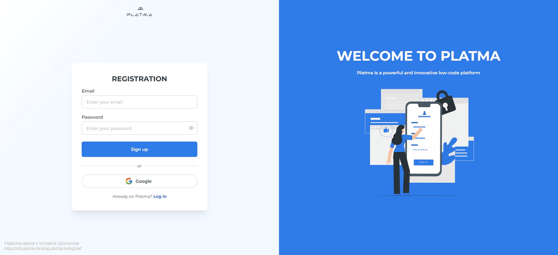
If you’re new to the PLATMA platform, Sign Up first. To do this, follow the steps below:
Welcome to PLATMA
👉 Sign up
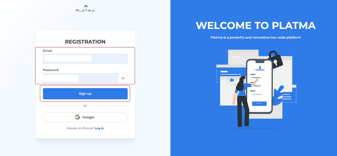
Sign up without a Google account
📍 Sign up without a Google account
📍 In REGISTRATION form
WARNING: take a note to remember your password. Click on the eye icon to make your password visible, and take note of your password.
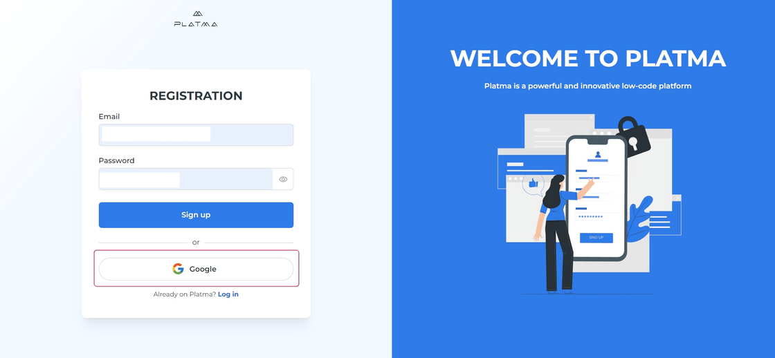
Sign up with a Google account
📍 Sign up with a Google account
👉 Log in
If you already have an account on the PLATMA platform, you need to Log in:

📍 Log in without a Google account
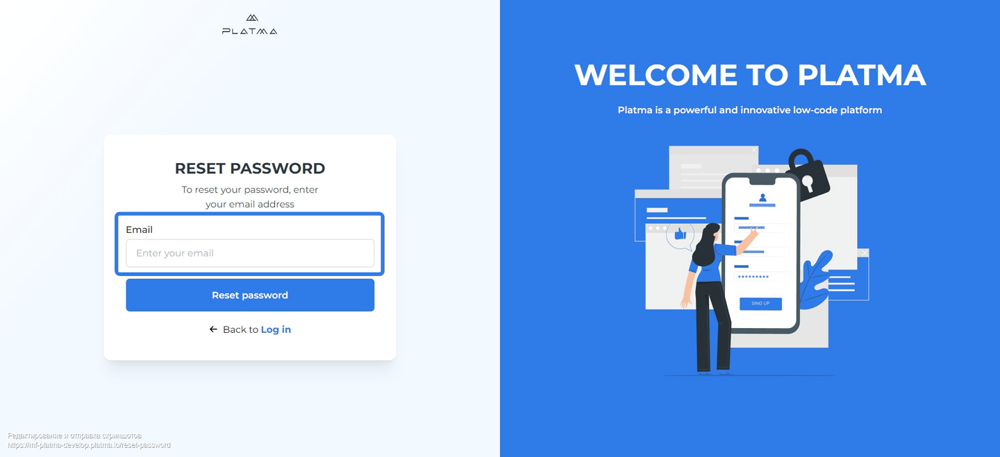
If you don’t remember your password, proceed to Forgot password
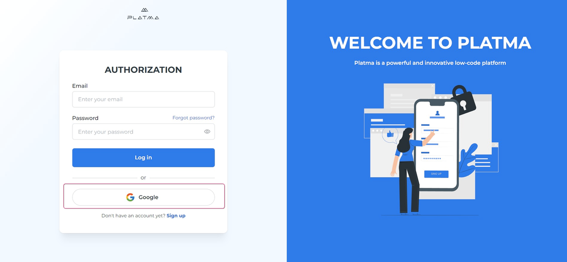
Log in with a Google account
📍 Log in with a Google account
This is a workaround solution when you forget your password. Don’t worry, and follow the steps below:
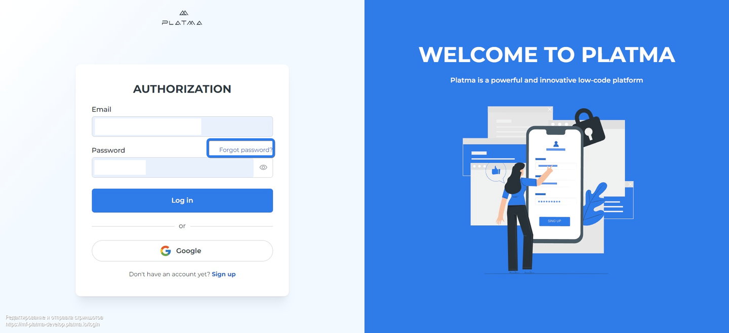
📍 Forgot password is a function for already existing accounts ONLY! So, it is not dedicated to unconfirmed accounts. This function works for Log in, not for Sign up.
So, if you try to enter your password up to three times and it doesn’t work, try resetting it.
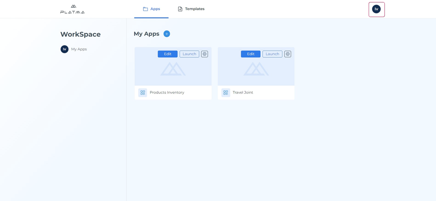
The Workspace is your dedicated space at the PLATMA platform. This Workspace screen has a Profile for your profile in the right user corner and two tabs, Apps and Templates, to work with.
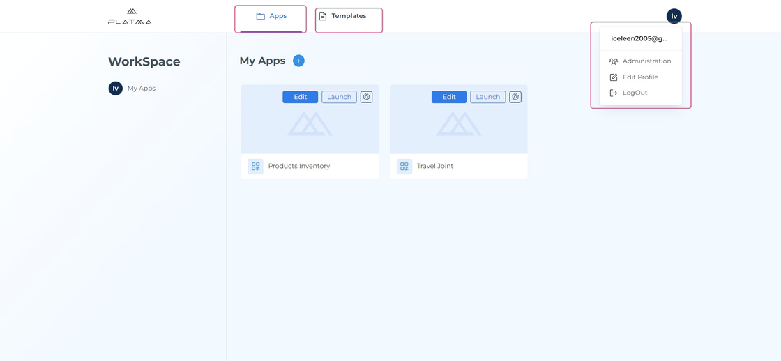
Profile, Apps, and Templates
Detailed information on Workspace and its tabs can be found in respective sections.
In the Profile, you can edit your personal details, image, name, password, and email (excluding password and email for Google accounts). The tab Apps is a catalog of your Apps, and the tab Templates is a showcase of templates currently available on the PLATMA platform.
👉 Profile
Click Profile to enter your profile details.
Profile
Once you click the Profile, a dropdown appears:
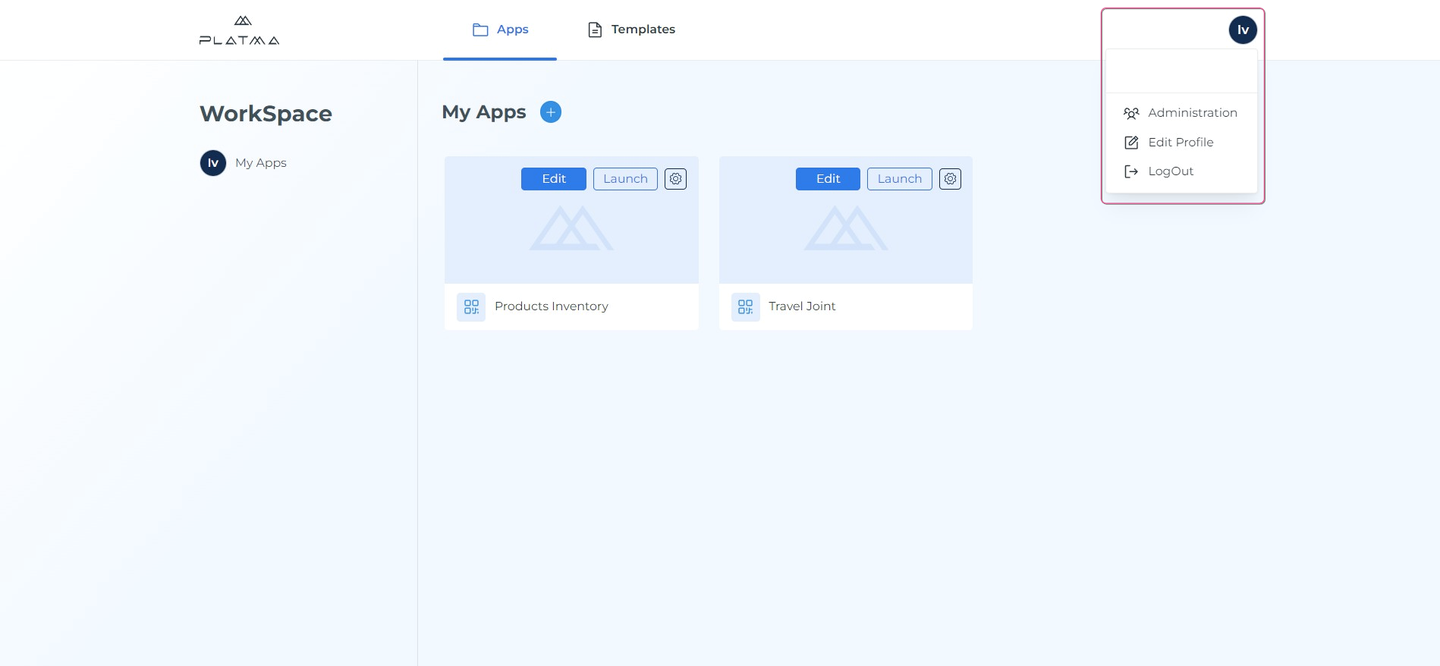
Profile dropdown
👉 Administration
Click Administration to manage users’ rights and access within your organization.
👉 Edit profile
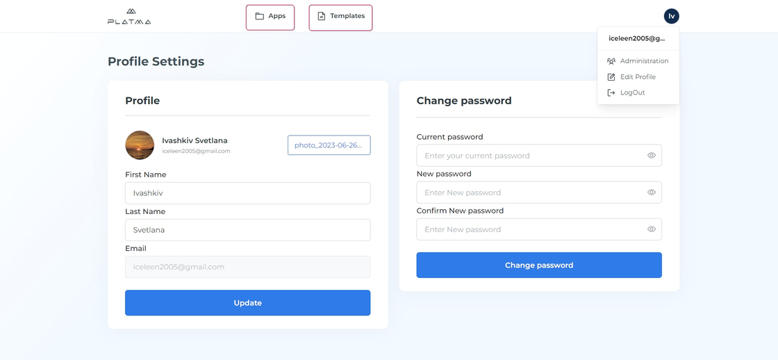
Click Edit Profile to navigate to the Profile Settings screen:
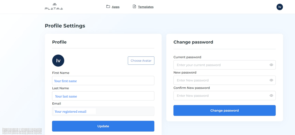
Profile settings
👉 Profile Settings
The Profile settings screen is divided into two parts: Profile and Change Password.
👉 Profile avatar
In the Profile, you can upload or change your avatar. To do this, follow the steps below:
Click the Choose Avatar button.
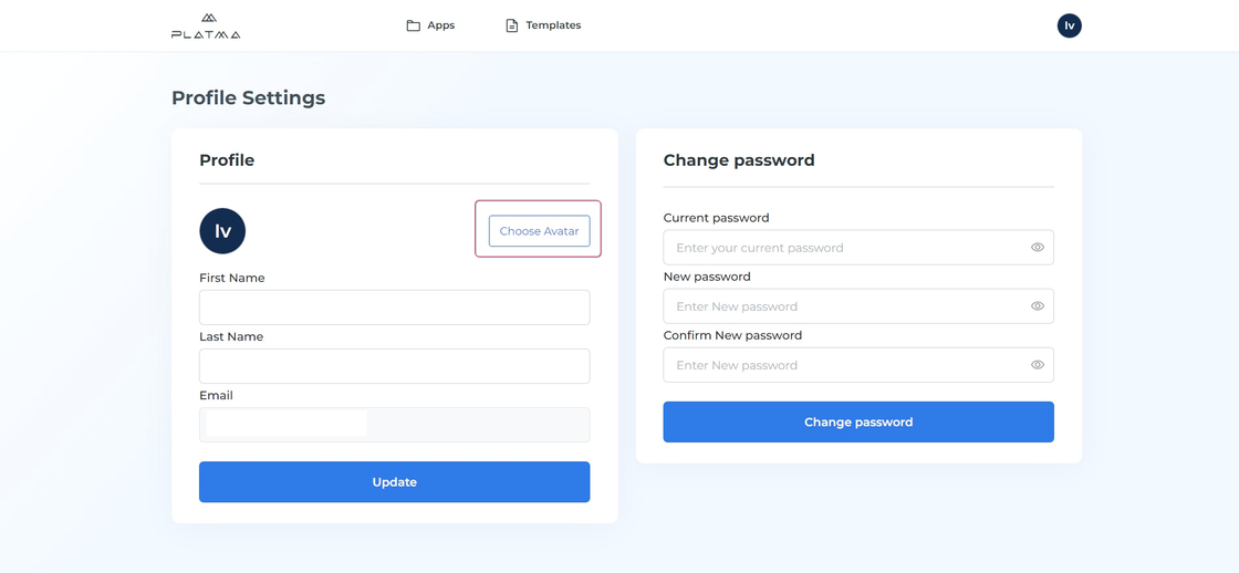
Avatar change button

New avatar added
Your avatar is updated.
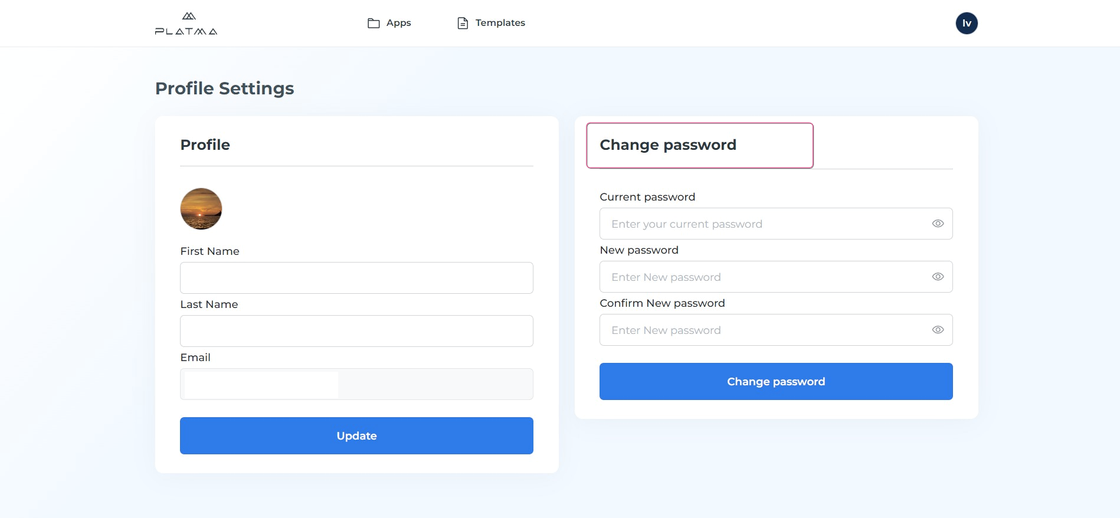
👉 Change password
If you wish to change your password, follow the steps below:
Change password
Go to the Change password pane.
Enter your current password in the text field “Current password”
Enter your new password in the field “New password”
Enter your new password again in the field “Confirm New password” to confirm your new password.
Click “Change password” to save changes.
Now, your password is updated.
WARNING: take a note to remember your password. Click on the eye icon to make your password visible, and take note of your password.
Remember: this option doesn’t work if you’re logged in with a Google account (you’ll see it blurred).
👉 Log out
Just click Log out in the Profile dropdown to log out of your profile.

Log out
Don’t forget to save all your changes before logging out.
If you don’t wish to log out and still need to continue your work in the Workspace, click the tab Apps or Templates to exit the Profile Settings screen and return to Workspace.
Return to Workspace
Tab My App
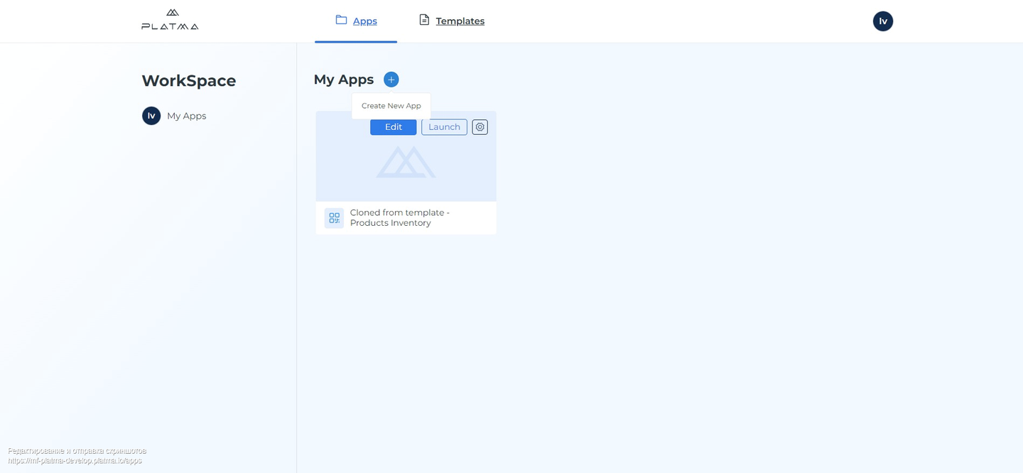
All your ready or draft apps are under the My Apps tab. On the dashboard, you’ll find all your draft or ready apps.
👉 How to add a new app:
Click the “+” sign near My Apps to create a new app.
Add New App
In the pop-up window:
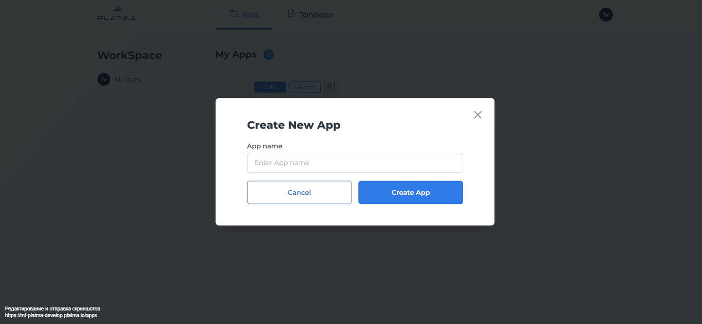
Create New App
Work with My Apps
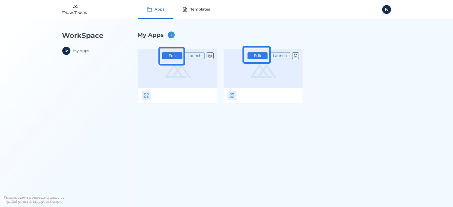
👉 How to work with your apps:
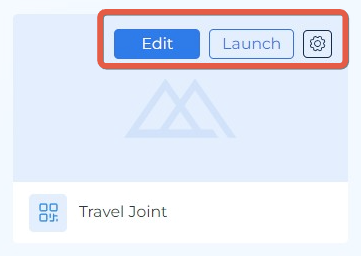
📍 Edit
Click the Edit button to navigate to Edit mode and access all the tools for editing.
📍 Launch
Click the Launch button to view the current progress of application creation. See the magic created by you.
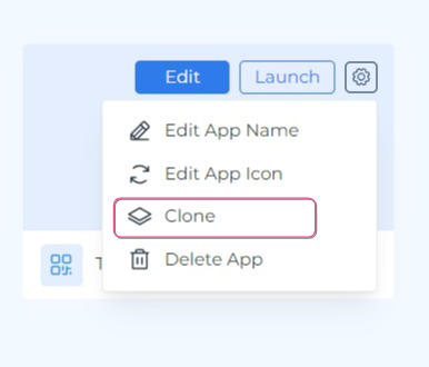
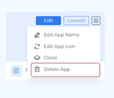
📍 Gear
Click Gear to edit the app name, edit the app icon, clone, or delete the app.
Click Launch to start your cloned or draft app.
📍 Introduction to the Edit mode
You can navigate to Edit mode only from the tab My Apps.
Navigating to Edit mode
It means you can edit only apps you created or cloned from other templates.
Hover the mouse on the app tile and click Edit.
If you use an app cloned from another template in the Edit mode, it will look like this:
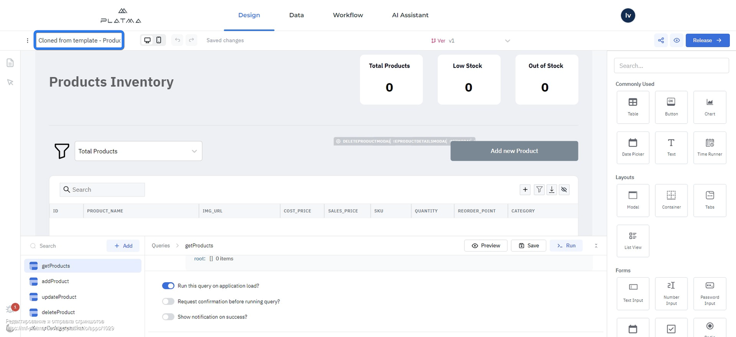
Edit mode view for cloned app
In the upper left corner, there’s an indication for a cloned app “Cloned from template – Name of Template”.
This indication helps to understand where you work: in a cloned app or the app created by you.
This is crucial because clones already contain data and settings, although editing them is still possible.
If you create your app from scratch, the Edit mode will look like this:
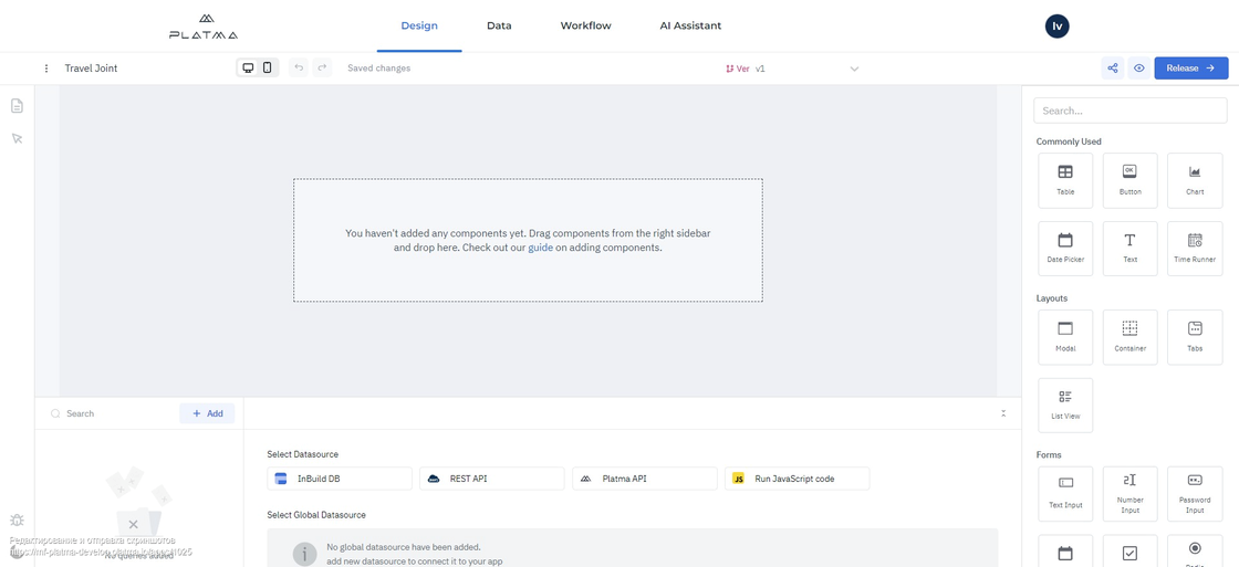
Edit mode view for created apps from scratch
All the controls are the same for cloned or created apps.
The difference is that in the cloned app, you’ll see all predefined settings, and you can edit. In the created-from-scratch app, you’ll see only an empty canvas initially.
Main tabs of the Edit screen
Look at the screen and familiarize yourself with the following elements:
Main tabs on the Edit screen
In the upper central part of the Edit screen, there are four tabs: Design, Data, Workflow, and AI Assistant.
Here, we provide some brief information about these tabs; detailed information is contained in a separate documentation section for every tab.
👉 Design
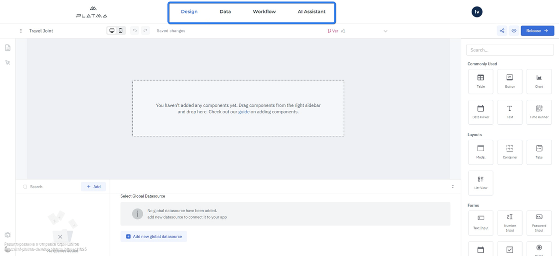
This tab is your main tool for creating or editing your app. At first sight, it looks a bit complicated, but don’t worry. PLATMA is here to help you. Tab Design is your canvas where you create your masterpiece and practice.
This tab gives you the power to create magic. Use this tab to create an app from scratch or edit an existing one. Detailed information about this tab can be found here: tab Design.
👉 Data
This tab is your sources tab. You can create your table here and connect your Data source. You can also perform actions in your table to adjust according to your needs. Detailed information about this tab can be found here: tab Data.
👉 Workflow
This section is to be updated. Detailed information about this tab can be found here: tab Workflow.
👉 AI Assistant
This is your AI assistant to facilitate development. You can control it using your voice. This is an extremely smart tool to accelerate and tailor your development. Use your voice instead of your fingers, and our AI engine takes care of the rest. Detailed information about this tab can be found here: tab AI Assistant.
This tab is your primary tool for creating or editing your app. At first sight, it looks a bit complicated, but don’t worry. We’re here to help you. Tab Design is your canvas where you create your masterpiece and practice.
It has the following components:
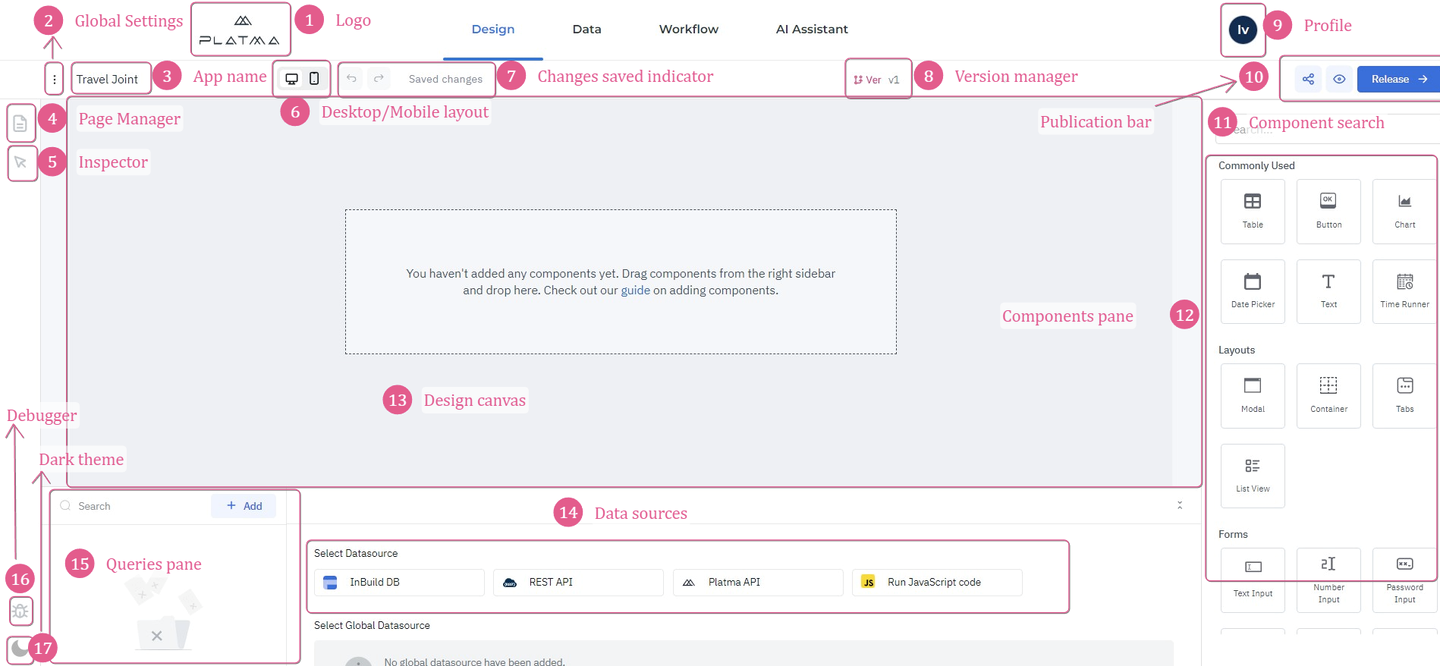
Elements of the Design tab
Elements of the Design tab
PLATMA logo
Click the PLATMA logo to navigate to the My Apps tab. All your changes are saved automatically.

PLATMA logo
👉 Global Settings
Click three dots (kebab menu) near the app name to open Global Settings.

Global Settings
These Global Settings allow to hide headers for launched apps, enable/disable Maintenance mode, adjust the width and height of the Design canvas, and choose the background color. Detailed information can be found in the article for Global Settings.
👉 App name
Here, you can see your app name as a name if you work in the app from scratch. You can also see the “Cloned from template – Name of template” if you work in the cloned app.
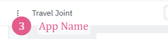
App Name
Click the PLATMA logo and see how to change an App Name on the tab My Apps / Gear.
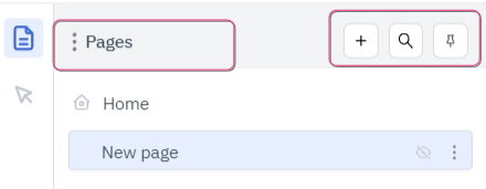
👉 Pages Manager
Click this icon to see all the pages of your app.
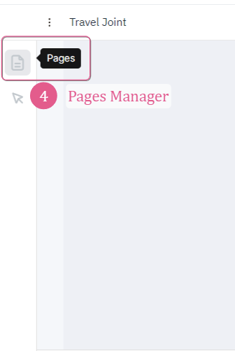
Pages Manager
Remember, you work on one canvas, so to provide a consistent app structure, you should use Pages Manager. Detailed information can be found in the article for Pages Manager.
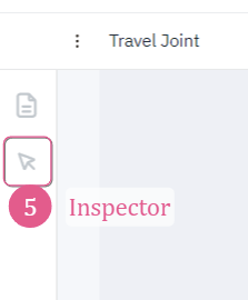
👉 Inspector
Click this icon to inspect queries, variables, components, globals, and pages.

Inspector
The Inspector can be used to inspect the data of the queries, properties, and values of the components on the canvas, global variables, and the variables set by the user.
It’s helpful to perform such inspections during the creation process from time to time to be sure your app creates magic the way you want it.
Detailed information can be found in the article for Inspector.
👉 Layout
Toggle between Desktop and Mobile layouts to see changes on Design canvas.
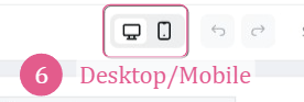
Desktop/Mobile Layout
This functionality allows you to toggle between Desktop and Mobile layouts to see changes on Design canvas in every option. Layout helps you to understand the application view on a desktop or mobile device.
Remember: always use this functionality if you need desktop and mobile options (e.g., create an app for mobile and desktop devices). Every layout has a predefined size, so you can adjust the component location on the canvas, considering the current layout. Position components on the canvas for one layout option and toggle to another layout to see the difference. Adjust every component for every layout separately to fit the canvas screen. If you don’t have enough space to position components in one layout, e.g., Mobile layout, don’t remove this element because it will also be deleted for Desktop layout. In this case, consider restructuring the current page to fit both layout options.
Switch the canvas to the Mobile layout by clicking the mobile icon on the topbar. Drag and drop a new component to the Design canvas. This component will not be visible on the Desktop layout unless Show on desktop is enabled by the component config inspector.
👉 Showing a component on the Mobile layout
Click on the component handle to open the component config inspector on the right sidebar. Scroll down to the Layout section and toggle on the Mobile Layout option. The width of the components will be adjusted to fit the Mobile layout.
INFO
The width of the component will be automatically adjusted to fit the screen while viewing the application in the App viewer.
👉 Changes saved indicator
All changes to the app are saved automatically. You don’t need to worry about unsaved changes.

Changes saved indicator
You can also return to the previous change or move forward to the next change and make necessary edits.
Use the left arrow to return one change, and use the right arrow to move one change forward.
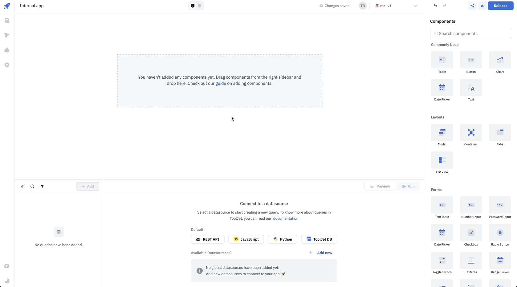
👉 Version Manager
You can always see the current version you work with in Version Manager.

Version Manager
Click on the dropdown for version control.
Version control
Click the Pencil icon to edit the chosen version, or click a Bin icon to delete the version. Navigate to the necessary version and proceed to edit or delete. You can also Create new version and continue your work with a new version. This precious functionality allows tracking several versions and making different changes to different versions without cloning an app every time. Just create new versions and change every version to see the difference.
When many creators work on the same app, Version Manager allows them to save their version of the app. This also prevents creators from overwriting the other creator’s work.
👉 Profile
Click the Profile icon to

Profile
Detailed information can be found in the article for Profile.
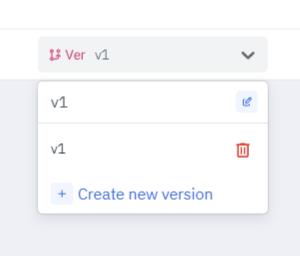
👉 Publication bar
The Publication bar is a valuable tool to preview, share, and release your app.
Publication bar
This tool is used when you want to see how your app will work in real-time in the environment. You can also share your app with other users (not strictly internal, but also any user outside PLATMA) and get useful help, recommendations, suggestions, or applauses about your masterpiece. This tool is a solution for cooperation to fine-tune your app. You can share and preview it at any stage. Detailed information can be found in the article for the Publication bar.
👉 Component search
This search field is designed to perform a component search.
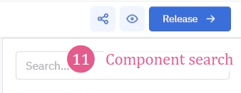
Component search
Start entering the component name here to see relevant results. From the results, you can choose the necessary component.
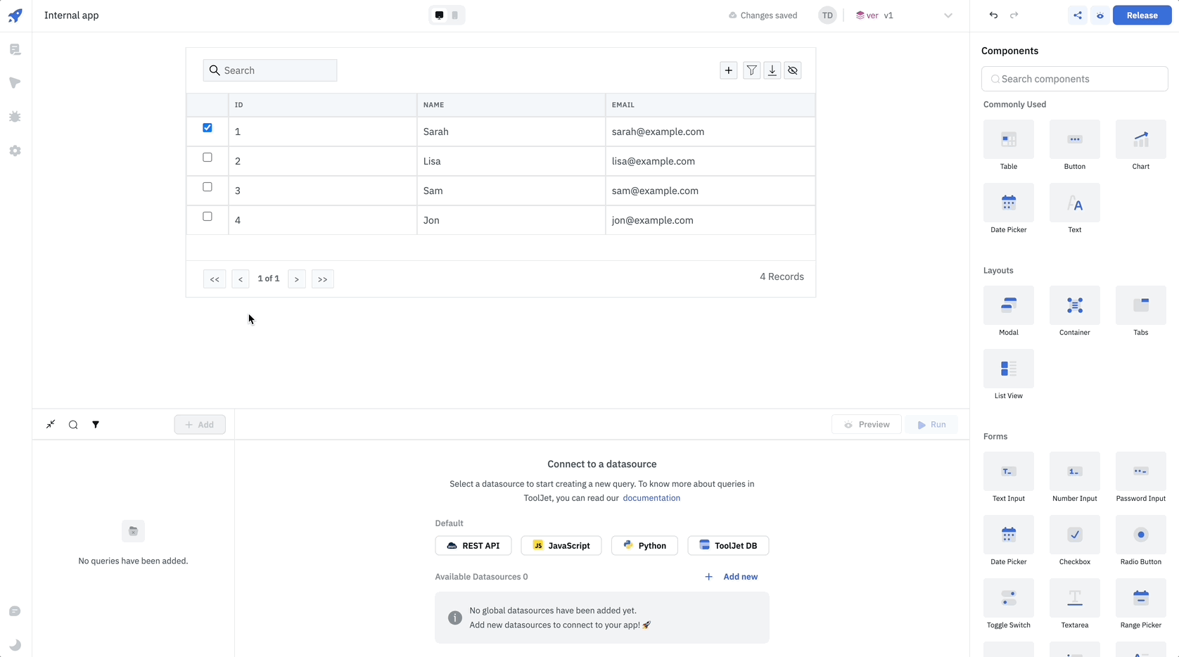
👉 Components pane
This is your design builder. Here are all the blocks for design available. Scroll up and down to find a necessary component, or use a search field to choose a component from the search results.
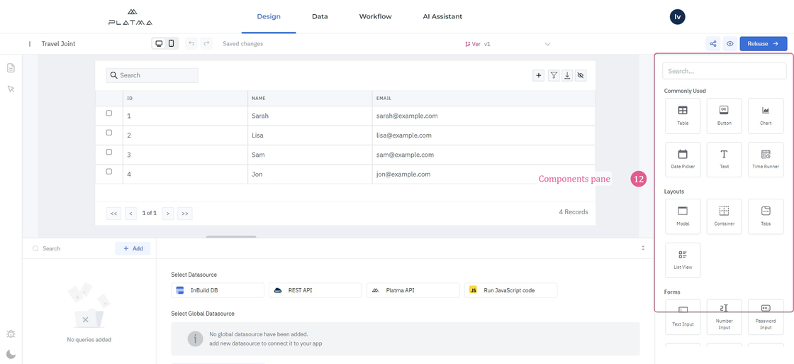
Components pane
You can quickly build or edit a cloned app using these blocks. This is an extensive section, so detailed information about all components and functions can be found in the article for the Components pane.
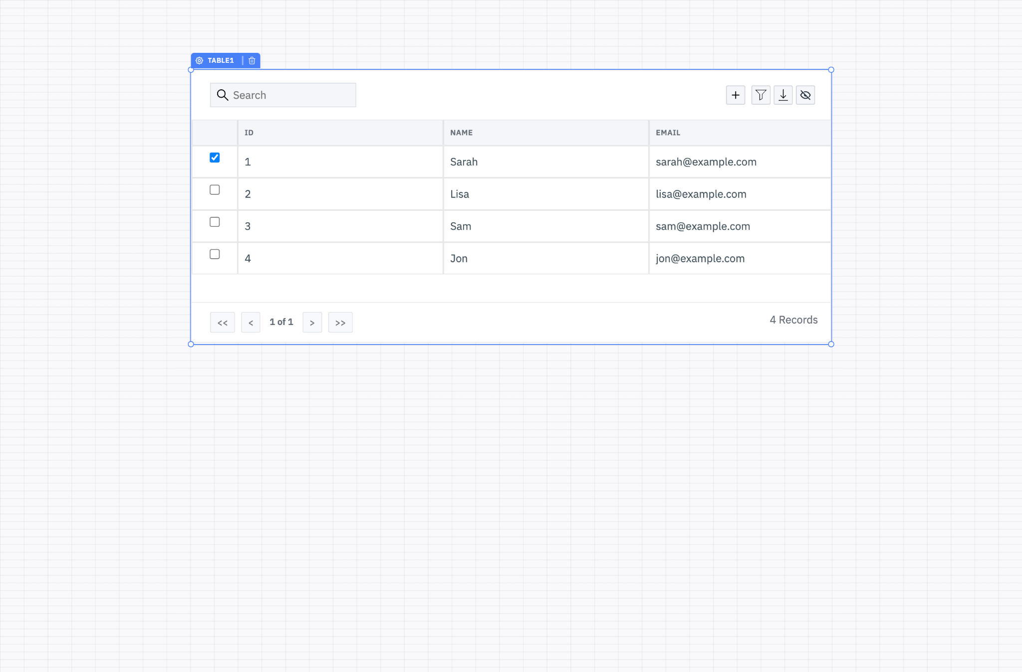
👉 Design canvas
This is your playground, where you implement your ideas.
Design canvas
You can drag and drop components from the Components pane here and make changes. You can also change the layout to see results for desktop and mobile devices (see Layout). You can interact with any component on Design canvas and navigate back or forward to track changes. Use your imagination and implement it right away. Detailed information about the Design canvas can be found in the article for the Design canvas.
👉 Data sources
Here you can select a predefined data source to add to your app, or you can choose a global data source.
You have the following set of predefined data sources:
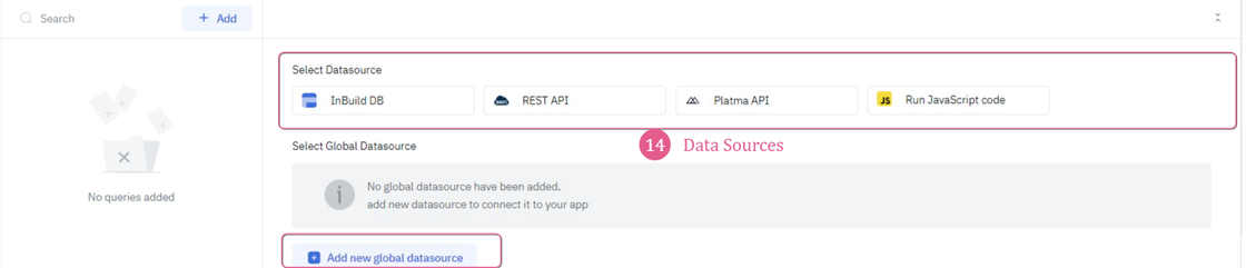
InBuild DB — this is an internal data source.
REST API — Representational State Transfer (REST) is an architectural style that defines a set of constraints for creating web services. REST API is a way of accessing web services simply and flexibly without having any processing.
PLATMA API — an API solution from PLATMA designed for the PLATMA platform.
Run JavaScript code — runs code from JavaScript. You can enter your code from JavaScript and monitor the performance of the code.
If you want another data source, click “Add new global datasource”. You will navigate to the screen of Data Sources.
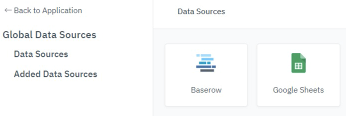
Screen of Data Sources
Here, you can see available data sources under Data Sources and connected data sources under Added Data Sources. To exit this screen, click Back to Application.
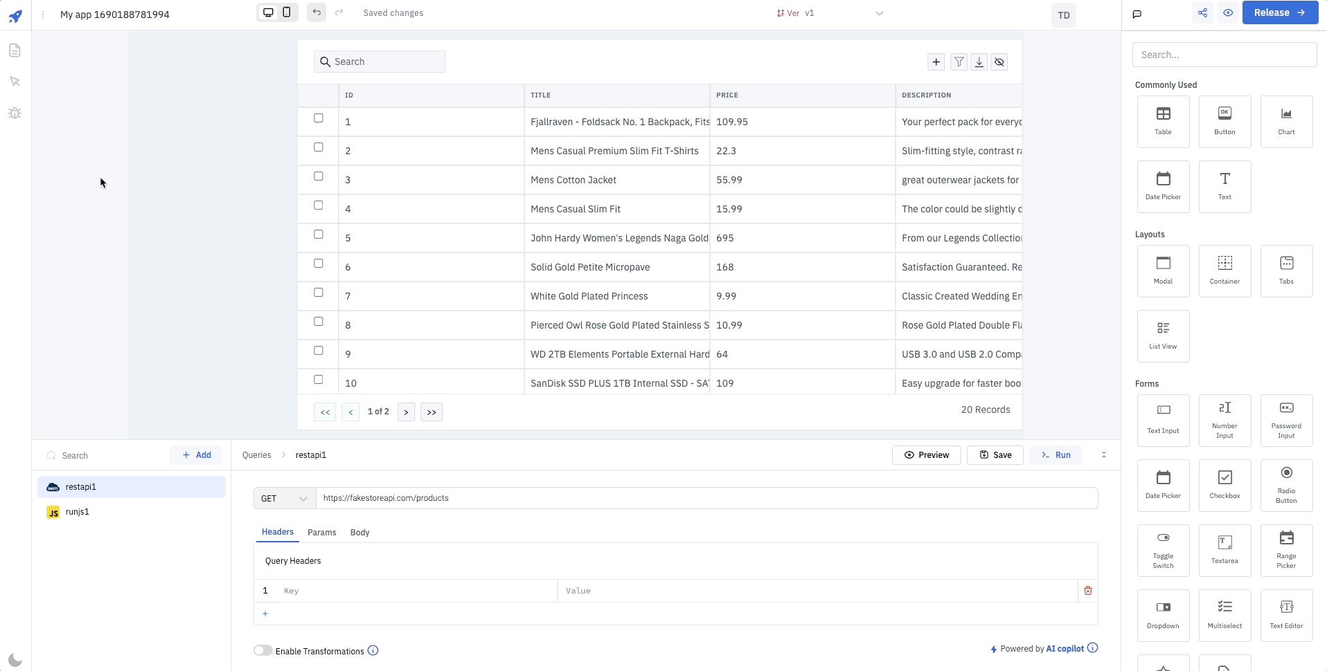
👉 Queries pane
This is a queries pane where you can create or adjust your query.
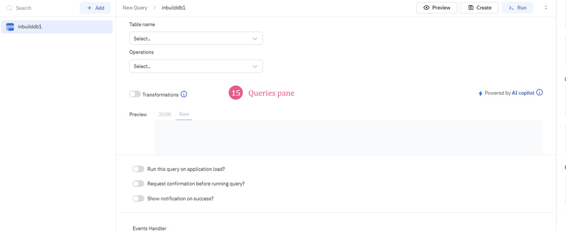
Queries pane
First, you should choose a Data source to enter the settings screen and proceed to query. Find a description of the Data source.
Detailed information on query settings can be found in the article for the Queries pane.
👉 Debugger
Debugger tool is your helper and assistant along the entire route of app creation. Debugger records any errors that occur during the execution of queries. For instance, if a database query fails because the database is unavailable or if a REST API query fails due to an incorrect URL, the errors will be captured and shown in the Debugger. Additionally, the Debugger provides pertinent information associated with the error alongside the error message.
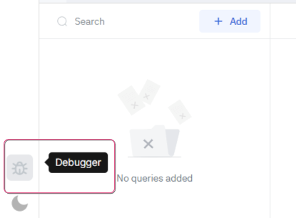
Click the Debugger icon to perform debugging. A pop-up appears with found errors.
Debugger pop-up
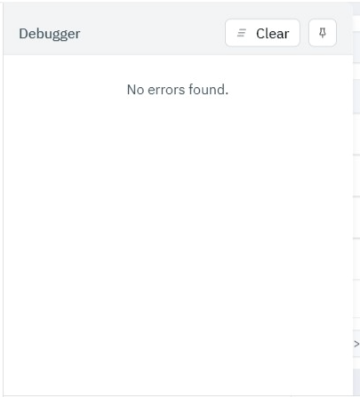
You can see the found errors as a list.
Click the Pin icon to pin the Debugger pop-up on the screen. It allows you to monitor errors in “live mode”. It will not disappear while you work with canvas or other elements. To unpin, click the Pin again.
Debugger consists of two main sections:
Debagger workflow
To clear errors, click “Clear.”
Remember: “Clear” doesn’t mean the bugfix; it just clears history. Perform the bugfix manually.
👉 Dark theme
We also have a tool to make you feel more comfortable while you create a masterpiece. We have a Dark theme.
Let’s see how it works.
Dark theme
Here we are: Dark theme. Do you know many professional developers prefer dark themes? Indeed, it has reasons:
Operating in the dark mode helps you reduce the intensity of blue light reflected from your monitor’s screen, offering you protection light.
PLATMA cares about your comfort.
Click to see all the pages of your app. Remember, you work on one canvas, so to provide a consistent structure for your app, you should use Pages Manager.
👉 Pages Manager

Pages Manager
👉 Settings
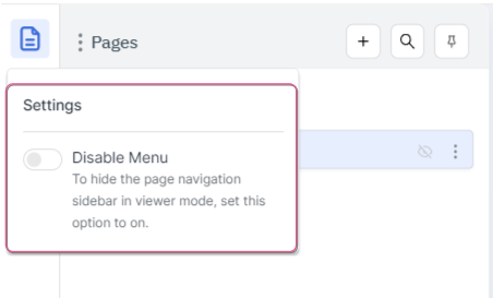
Click this icon to see the Settings:
Settings
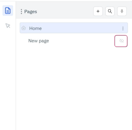
👉 Enable/Disable menu
Here you can see all the pages of your app. If you want to hide this sidebar navigation in viewer mode, pull the slider to enable/disable:
Hide/Show sidebar
👉 Add, Search, and Pin
📍Add
You can also find three buttons in the right part:
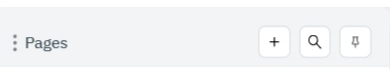
Buttons
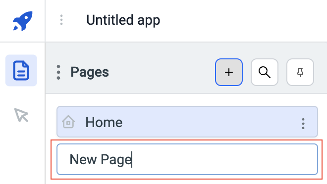
On clicking the “+” button, a new page will be added. Enter the name of the page and press Enter.
Pin
📍 Pin the page’s panel from the Pin button, and the panel won’t close until you unpin it.
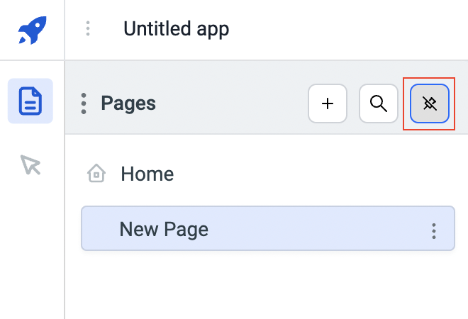
Pin/unpin pages panel
📍 Search
If there are many pages on the panel, then you can use the Search to look for the specific page.
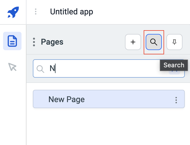
Search
👉 Pages options
There are several options available for a Page. To use these options, click on the kebab menu on the right of the page card.
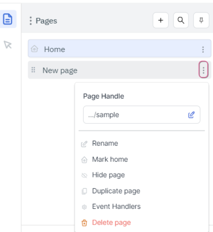
Kebab menu
👉 Page Handle
Page Handle is the slug that is added at the end of the application URL. Page Handle gets its default value when the page name is entered on the creation of the page. You can change the Page Handle from this option.
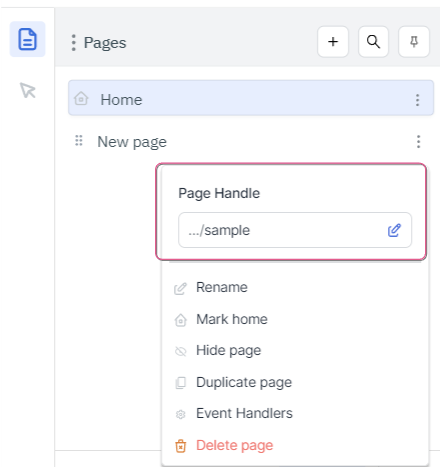
Page Handle
👉 Rename
The Rename option allows you to rename the page.
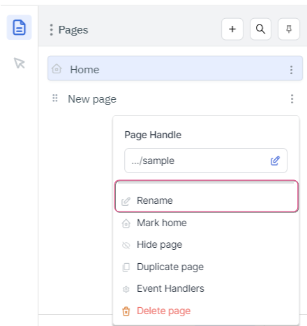
Rename
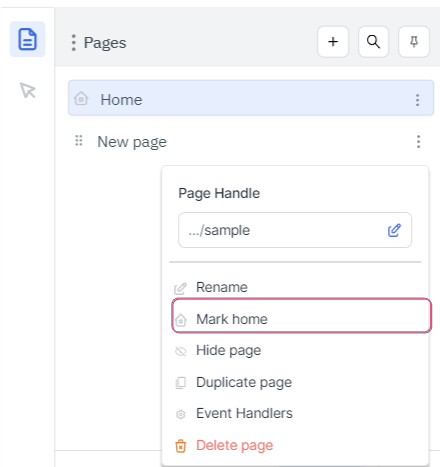
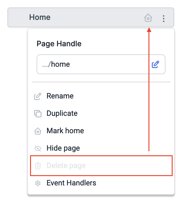
👉 Mark Home
Use the Mark Home option to mark a page as the default landing page of the app. So, the page Mark Home is loaded first whenever the app is loaded. This is an introduction page for your app.
Mark Home
INFO
The page marked home has a Home icon on the left of the Page Card.
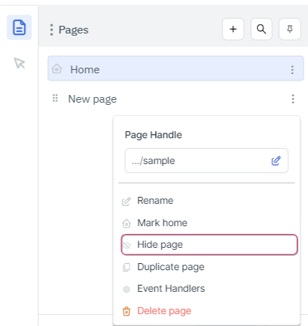
👉 Hide Page on app menu
The Hide Page option can be used to hide a page from the page navigation sidebar in the viewer mode.
Hide Page
INFO
If a page is hidden, then you’ll see an eye icon on the right of the card.
Hidden page
You can go to the options again and unhide the app from the page navigation sidebar.
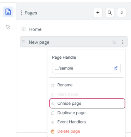
Unhide page
INFO
After hiding a page, although it may not appear in the page’s navigation sidebar, it can still be accessed by utilizing either the switch page action or the page URL.
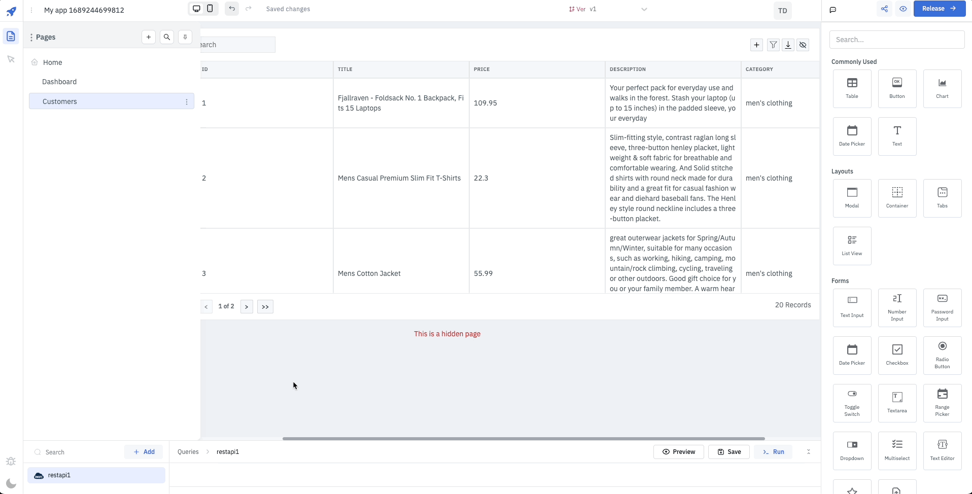
Switch page for hidden page
👉 Duplicate
The duplicate page option allows you to create and add a copy of the page in the pages list. The duplicated page will be a replica of the original page.
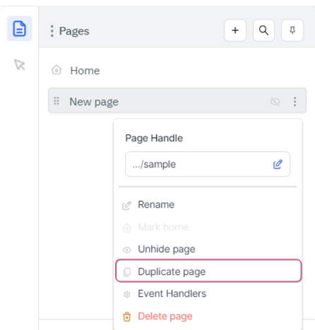
Duplicate page
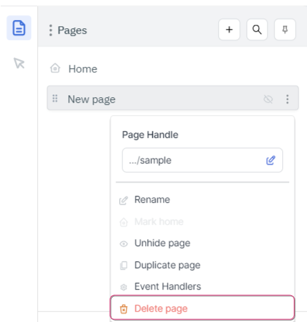
👉 Delete Page
You can delete a page from an app using this option.
Delete page
INFO
If a page is Marked Home then you can’t delete it, and the Delete page option will be disabled.
Deleted page
👉 Event Handlers
Click Event Handlers to browse the options.
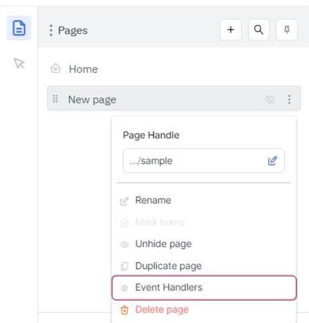
Event Handlers
This section is to be updated.
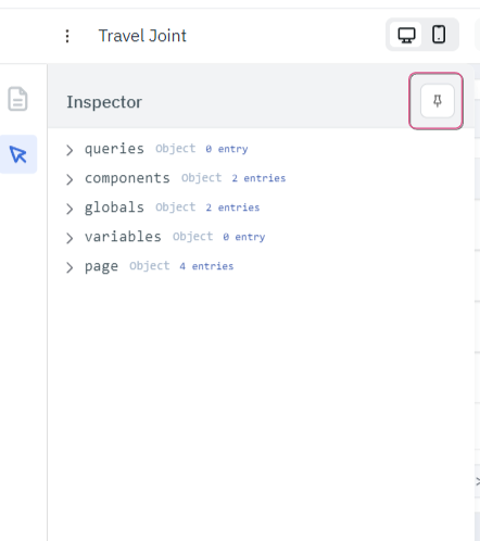
The Inspector can be found here:
Inspector
The Inspector can be used to inspect the data of the queries, properties, and values of the components that are there on the Design canvas, global variables, and the variables set by the user.
Let’s look at the Inspector panel layout:
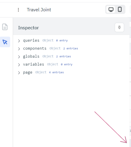
Pin/Unpin Inspector
Resize Inspector
On hovering on the Inspector element, the copy path and copy value buttons will appear on the right of the item. Copying the path option and pasting it onto the component property or query parameter will always get the dynamic value, but using Copy value option will copy the current value of the item and will be static when pasted in a component property or query parameter.
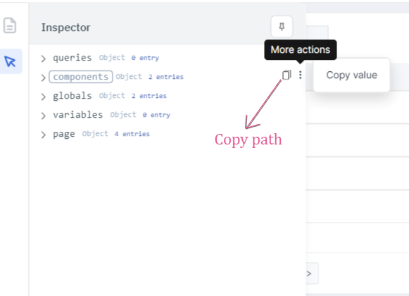
Copy path and Copy value
👉 Sections
The Inspector panel has the following four main sections:
👉 Queries
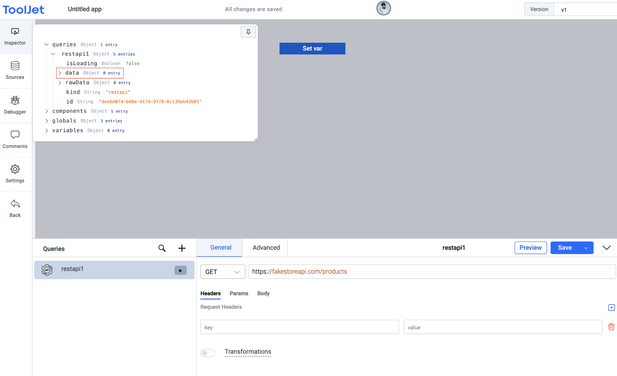
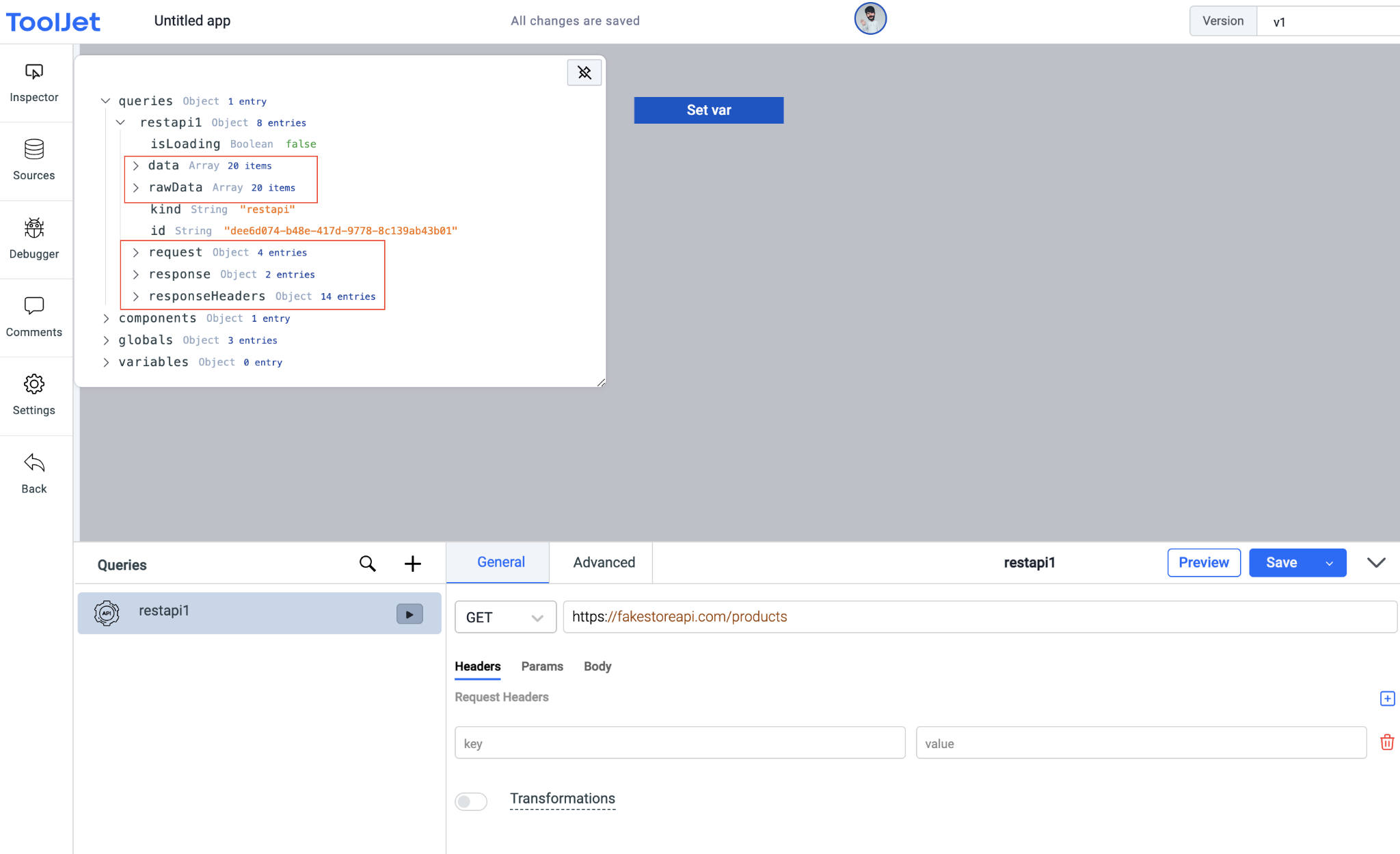
The queries section can be used to inspect the query details, but the data of the query will only be available if the query has been run/triggered.
Note: you can click on the Preview button on the query manager to check the response (data) of the query without triggering it.
Example
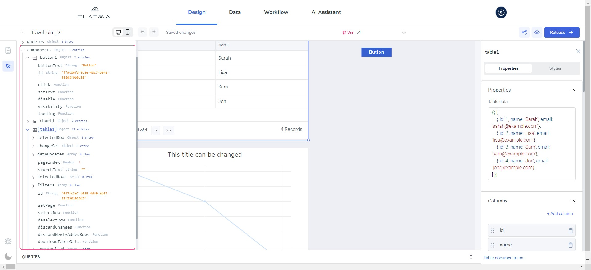
👉 Components
The Components section can be used to inspect the properties and values of the components added to the canvas.
👉 Globals
The Globals section consists of the following sub-sections:
👉 Variables
The Variables section includes all the variables set by the user in the application. These variables can be set from the event handlers from the components or the queries. The variables will be in the key-value pair and can be accessed throughout the application.
👉 Page handle: is the slug added at the end of the application URL. Handle gets its default value when the page name is entered on the creation of the page. Read about how to change the Page Handle.
name: is the name of the inspected page.
id: is the id of the inspected page.
The Publication bar is a valuable tool to preview, share, and release your app.

Publication bar
This tool is used when you want to see how your app will work in real-time in the environment. You can also share your app with other users (not strictly internal, but also any user outside PLATMA) and get helpful help, recommendations, suggestions, or applauses about your masterpiece. This tool is a solution for cooperation to fine-tune your app. You can share and preview it at any stage.
👉 Share
Share your applications with a unique URL generated automatically or edit the URL slug to personalize it.
Click Share. A dialog window appears.
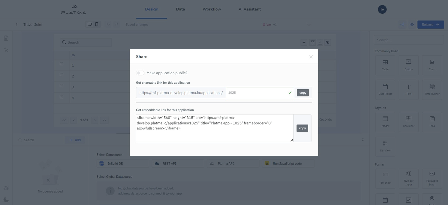
Share screen
👉 Preview
Clicking on the Preview button will open up the currently opened version of the app in the new tab. This is handy when the creator wants to check the app preview immediately in production.
👉 Release
Release the app to publish the current version of the app and push the changes into production.
Note: PLATMA will block editing of an app’s Released version and display a prompt to create a new version to make the changes. This is to prevent accidentally pushing an unfinished app to the live version.
Here is detailed information about all elements of the design-builder, including their functions.
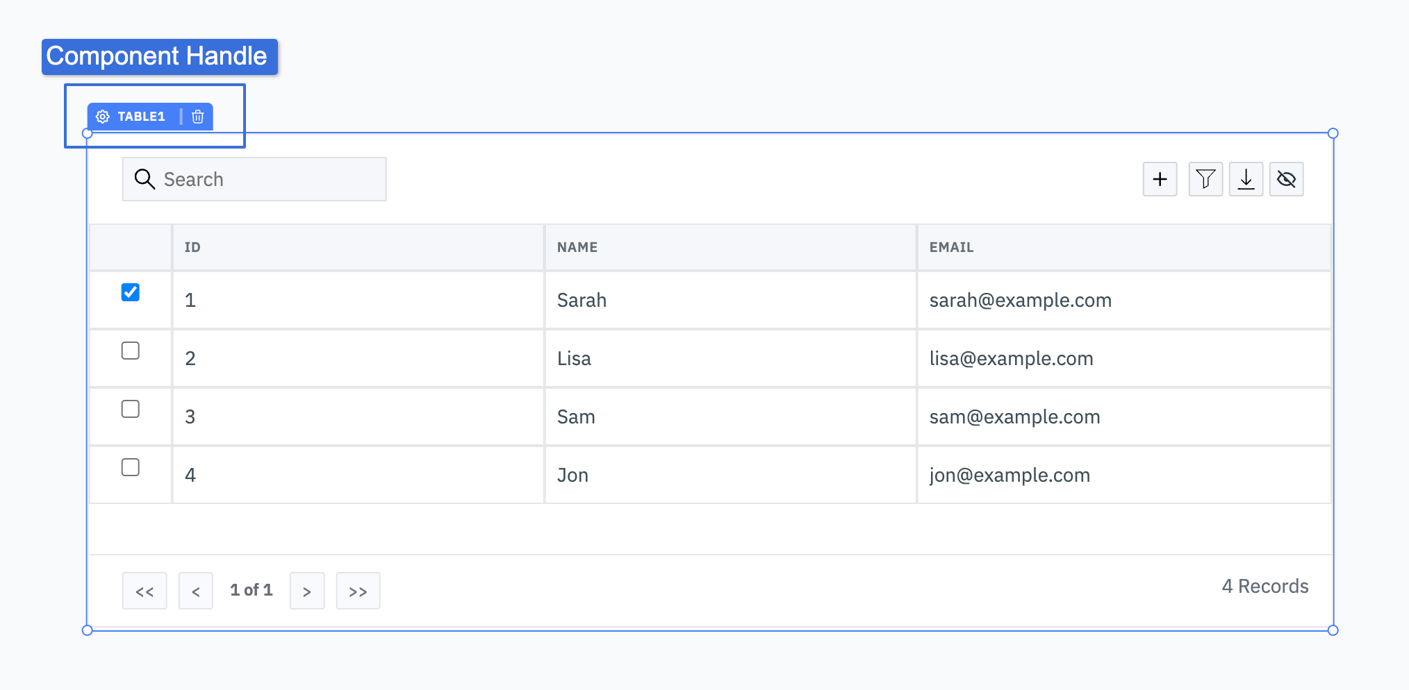
The Component Config Inspector is also called a component inspector. It contains all the available settings for the selected component and is where you set values, update component names, and create event handlers. The Component Inspector organizes settings into different sections, such as Property and Styles.
To open the Component Config Inspector, click on the component handle that is present on the top of the component, including + Component Name, and the component inspector will open up on the right side:
Canvas is the center area of the PLATMA app builder where the application is built. You arrange the components by dragging them from the Components library (right-sidebar).
INFO:
👉 Arrange Components
All the components are fully interactive in Edit mode – to prevent interaction, you can click and hold the Component Handle to change the component’s position.
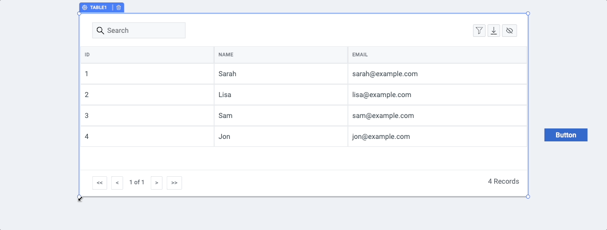
👉 Resize Components
Components on the canvas can be resized from the edges.
You can precisely set the position of selected components using the keyboard arrow keys after clicking the component handle.
👉 Group Components
PLATMA platform comes with flexible components to group other components, such as Container and Form. Drag and drop components in containers/forms to create a group of nested components. All components can be nested in this way.
👉 Hide or Disable Components
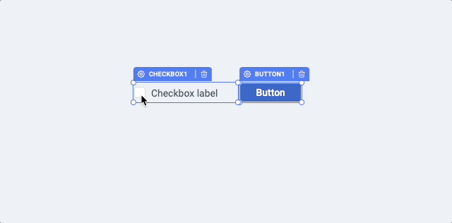
Hide or Disable a component by setting its Visibility or Disabled property to true. Click on the component handle to open the config inspector on the right side. These values can also be evaluated as true based on a truthy value. For example, you can use the property of one component to toggle the Visibility property of another component dynamically, you just need to write a conditional statement.
For example: We want to disable a button when a checkbox is checked, so we can simply use {{components.checkbox1.value}} in the Disable property of the button. {{components.checkbox1.value}} evaluates to true when the checkbox is checked and false when unchecked.
👉 Clone Components
You can clone existing components on the canvas by cmd/ctrl + d.
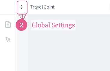
To configure the app’s global settings, click on the kebab menu (three vertical dots) on the left of the app name.
Global Settings
Global Settings include:
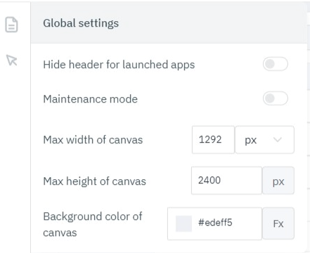
Global Settings
When in maintenance mode, on launching the app, the user will get an error message that the app is under maintenance.
Query Editor
Here is the info for both: REST API and Platma API.
If there are any changes in usage or behavior, the updated documentation version will contain additional or changed information with highlighting.
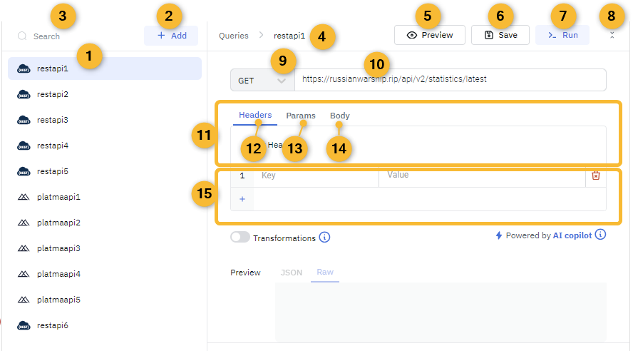
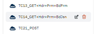
👉 List of created queries
On hovering over a particular query, the options appear to rename or delete this query.
List of queries
👉 Button Add
This button is designed to add a new query.
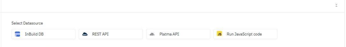
👉 Adding a new query
To Add a new query, it’s necessary to select a Datasource first.

Select Datasource and click on it. In this article, we explore only REST API and PLATMA API. A new nameless query appears on the left pane. Edit the name of the new query from the list by clicking a pencil icon, or edit the name in the Name field of the selected query.
👉 Search
Here you can search for the specific query through the query list.
Search field
👉 Name field of the selected query
You can select a specific query in #1. On-hover has an icon with the option to edit the name of the query.
Name field
👉 Preview
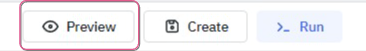
Preview
The Preview button is used to preview the data returned by the query. The data will be displayed in the preview section at the bottom of the Query panel.
Preview data field
This helps debug the query and investigate the data returned by the query without triggering the query in the app.
The preview appears without saving or executing the query in the main thread, where other elements on the Design Tab may have interoperability with the query results. The Preview button allows checking if all query options are set correctly. It also allows to use a particular value from the query result as a variable in another element.
👉 Save
The Save button is for saving the current query for future use.
Save button
The Save button appears for the created and set query ONLY.
👉 Run
The Run button is for running the current query.
Run button
A query is saved automatically before running (if there are changes).
👉 Hide
Click this icon to minimize/restore the Query Editor window and allow more space for the Design area instead.

Hide icon
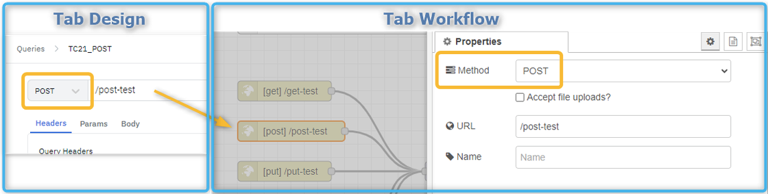
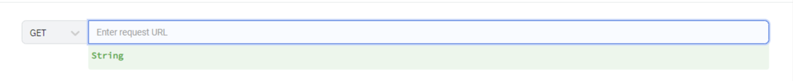
👉 Selector for Type of request
(supported types are: GET / POST / PUT / PATCH / DELETE)
INFO: It is recommended to read the article Types of requests for detailed information about requests.
Note:
For PLATMA API type of request should correspond to the type of request in the receiving node “http in” on the Workflow Tab. For example:
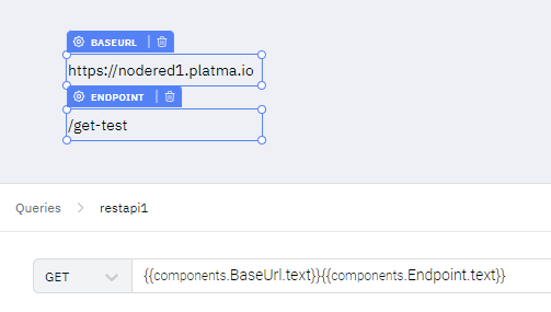
👉 URL field
Enter the endpoint of the current request here.
For the PLATMA API query URL format should be
/string
For REST API query URL format should be
http(s)://domain.com
URL with host “localhost” – NOT SUPPORTED
URL formatted as “IP:port” f.e. “http(s)://192.168.1.1” – NOT SUPPORTED
URL with IPv6 – NOT SUPPORTED
In general, URL should fit Regular Expression:
/(https:\/\/www\.|http:\/\/www\.|https:\/\/|http:\/\/)?[a-zA-Z0-9]{2,}(\.[a-zA-Z0-9]{2,})(\.[a-zA-Z0-9]{2,})?/;
Note. URL field supports runtime variables. See article Runtime variables.
👉 Tab selector
This element is for switching between the Options for request – Headers, Params, Body.
Tab selector
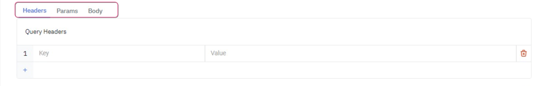
👉 Headers
Headers are the options for query, and they can be placed in Table-view form
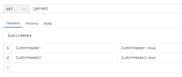
Headers
Note. Headers support runtime variables. See article Runtime variables.
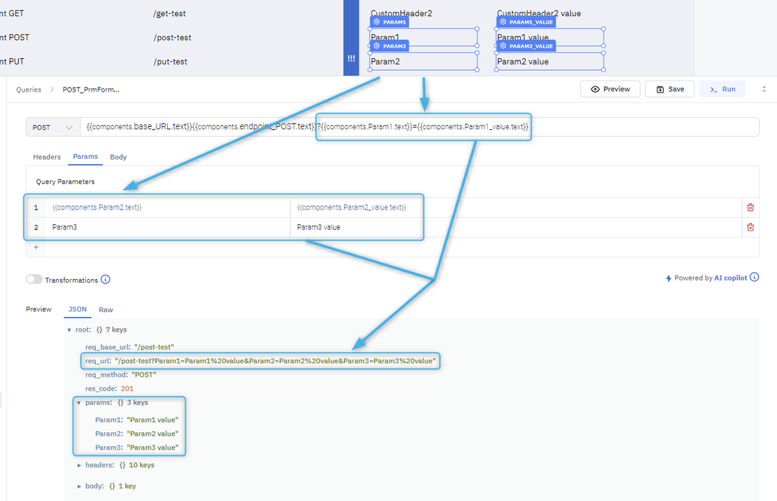
👉 Params
Params (queries) can be added in two ways:
The first way to add them is to type pairs of “key and value” in the form under the tab Params:
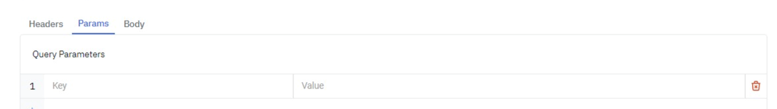
Params
The second way is adding to the URL string using “?” and “&” separators.
Data from these two areas where a user can add Params are combined to get a final summary version of Params. For example, the user can add Param1 and Param2 as part of the URL and add Param3 in Form-view under the tab Params of Query options.
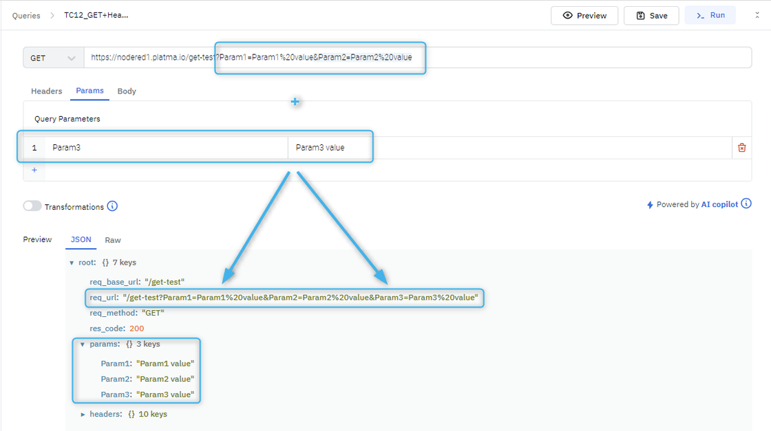
Note: these Params support runtime variables. See article Runtime variables.
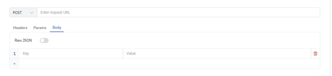
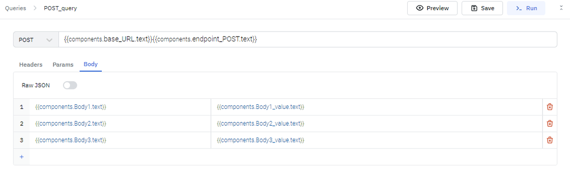
👉 Body
The Body can be specified for requests: POST, PUT, PATCH, and provide the query details.
Body
For requests: GET and DELETE — the Body also could be specified, but it is skipped by the back-end without any error.
All the information on types of requests can be found in the article Types of requests.
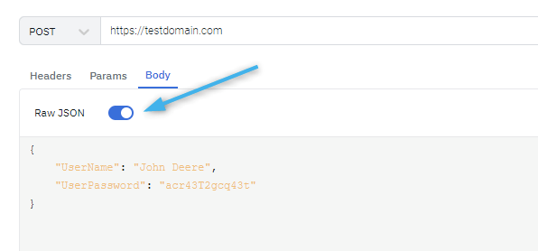
The Body could be specified in two ways:
a) Body as Table-form under the Body tab, the same way as Headers.
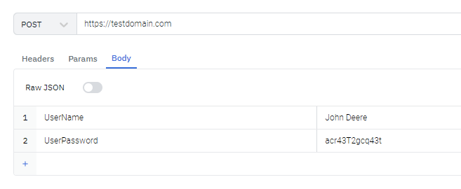
Body in Table-form
b) Body as Raw JSON – to use this option, switch toggle “Raw JSON” to “ON” position, and Table-form will be replaced by a field to specify data in JSON format
Body as Raw JSON
Note: a query can contain both types of Body simultaneously: Table-Form and Raw JSON. Move Raw JSON toggle to ON and OFF positions to specify the exact data to be used in a query runtime.
Note 2: the Body area supports runtime variables. Detailed information about runtime variables can be found in the article Runtime variables.
👉 Mutable area
This is an area for filling in details of Options for request. It can be Table-view or Text-area.
👉 GET
GET requests are the most common and widely used methods in APIs and websites. Simply put, the GET method retrieves data from a server at the specified resource. For example, say you have an API with a /users endpoint. Making a GET request to that endpoint should return a list of all available users.
Since a GET request only requests data and does not modify any resources, it’s considered a safe method.
👉 Check API with GET requests
The GET method will likely be the most frequent type of request made by service consumers, so it’s important to check every known endpoint with a GET request.
At a basic level, these things should be validated:
👉 POST
In web services, POST requests are used to send data to the API server to create or update a resource. The data sent to the server is stored in the Вody of the HTTP request.
The simplest example is a contact form on a website. When you fill out the inputs in a form and hit Send, that data is put in the response body of the request and sent to the server. This may be JSON, XML, or query parameters (there are plenty of other formats, but these are the most common).
It’s worth noting that a POST request mutates data on the backend server (by creating or updating a resource), as opposed to a GET request which does not change any data.
👉 Check API with POST requests
The second most common HTTP method is POST. POST requests are used to send data to the API server and create or update a resource. Since POST requests modify data, it’s important to have API tests for all of your POST methods. Use Preview to see the results.
Here are some tips for POST requests:
👉 PUT
Like POST, PUT sends data to the API to update or create a resource. The difference is that calling the same PUT request multiple times will always produce the same result. In contrast, repeatedly calling a POST request has the side effect of creating the same resource multiple times.
Generally, when a PUT request creates a resource, the server will respond with a 201 (Created), and if the request modifies an existing resource, the server will return a 200 (OK) or 204 (No Content).
👉 Check API with PUT requests
Checking an API’s PUT method is very similar to testing POST requests. But now that we know the difference between the two, we can check API to confirm this behavior.
Check for these things when testing PUT requests:
👉 PATCH
A PATCH request is one of the lesser-known HTTP methods, but it is included in the list since it is similar to POST and PUT. The difference with PATCH is that you only apply partial modifications to the resource.
To expand on partial modification, say your API has a /users/{{userid}} endpoint, and a user has a username. With a PATCH request, you may only need to send the updated username in the request body – as opposed to POST and PUT, which require the full user entity.
👉 Check API with PATCH requests
Since the PATCH method is so similar to POST and PUT, many of the same checking techniques apply. It’s still important to validate the behavior of any API endpoints that accept this method.
What to look for when checking your PATCH requests:
A successful PATCH request should return a 2xx status code.
PATCH requests should fail if invalid data is supplied in the request — nothing should be updated.
👉 DELETE
The DELETE method is exactly as it sounds: delete the resource at the specified URL. This method is one of the more common in APIs, so it’s good to know how it works.
If a new user is created with a POST request to /users, and it can be retrieved with a GET request to /users/{{userid}}, then making a DELETE request to /users/{{userid}} will completely remove that user.
👉 Check API with DELETE requests
DELETE requests should be heavily tested since they generally remove data from a database. Be careful when checking DELETE methods. Make sure you’re using the correct credentials and don’t operate with real user data.
A typical check for a DELETE request would look like this:
In addition, sending a DELETE request to an unknown resource should return a non-200 status code.
👉 Runtime variables in Queries
Runtime variables allow the use of mutable values for various fields. That means the user can use the values he doesn’t have in a Query initially and get them after the App is designed and run. In other words, the original value will be modified when you make a change.
This functionality is implemented by indicating a keyword and component name. In this way, a user can manipulate query options according to App’s behavior and the user’s actions.
👉 URL Variables
For REST API, the URL field supports variables, e.g.
URL variables for REST API
For PLATMA API, the URL field does not support variables.
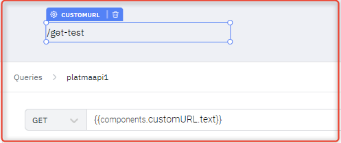
PLATMA API
👉 Headers Variables
Headers support variables for both REST API and PLATMA API.
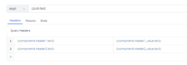
Headers variables
👉 Params variable
Params support variables for both REST API and PLATMA API.
Due to the opportunity to specify Params in two ways, the user can specify the variables in both two locations or just in one location. Decide it yourself. Also, the user can specify text Params in one location and variable Params in another location in any combination.
Params variables
👉 Body Variables
The Body supports variables for both REST API and PLATMA API.
The Body can be specified by runtime variables in Form-view.
Body variables
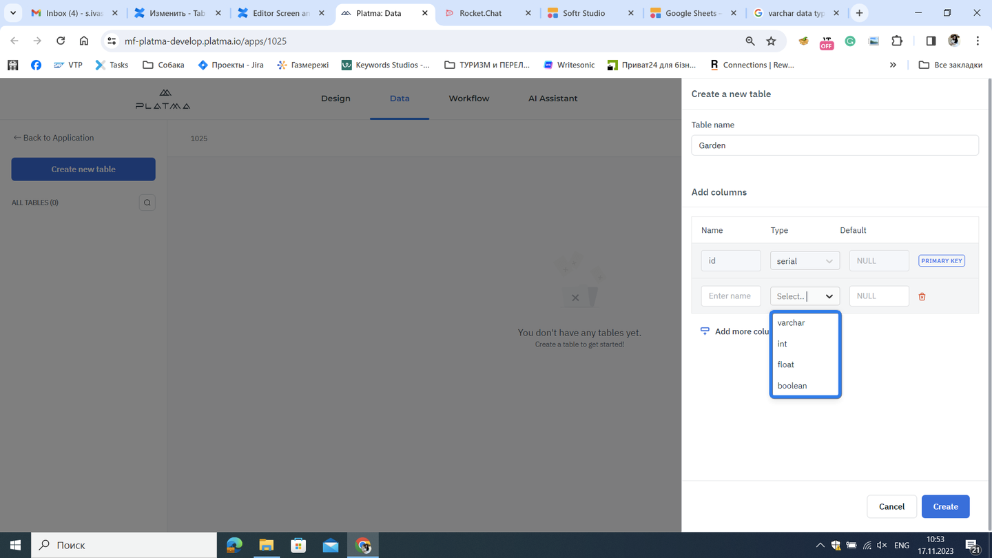
This tab is your sources tab. You can create your table here and connect your MySQL Data Base. You can also perform actions in your table to adjust according to your needs.
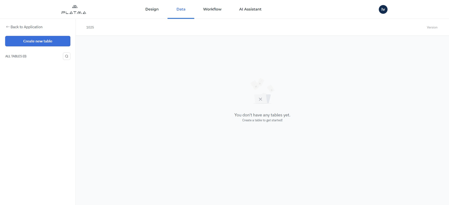
Tab Data overview
This is the view of an empty Data tab. Click Create new table to add a table.
Create new table
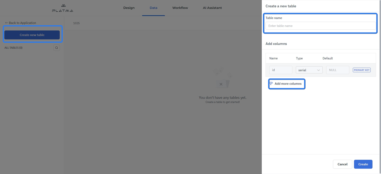
Enter a new table name in the text field. Configure your table by adding columns, adding names for columns, selecting values, and defining defaults. See an example below:

You can perform your adjustments for ID, Type, and Default when adding a new column.
Remember: the first column, PRIMARY KEY, is a default column, and you can’t change it.
Detailed information on data types and defaults can be found in the article Data types and defaults.
This article explains what data types are used and what defaults are accepted.
A data type (or simply type) is a collection or grouping of data values, usually specified by a set of possible values, a set of allowed operations on these values, and/or a representation of these values as machine types. A data type specification in constraints means the possible values that an expression, such as a variable or a function call, might take. On literal data, it tells how the programmer intends to use the data. Usually, the basic data types of integer numbers (of varying sizes), floating-point numbers (which approximate real numbers), varchar, and Booleans are supported.
This is the view of an empty Data tab. Click Create new table to add a table.

Create new table
Enter a new table name in the text field. Configure your table by adding columns, adding names for columns, selecting values, and defining defaults. See an example below:
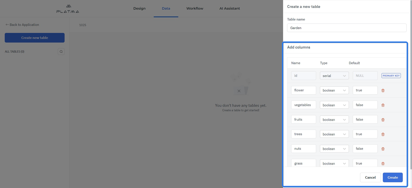
Adjustment of values in a table
You can perform your adjustments for ID, Type, and Default when adding a new column.
Remember: the first column, PRIMARY KEY, is a default column, and you can’t change it.
In the “Name” field, enter a name for every column.
In the “Type” field, you should select the necessary type of your data from the dropdown.
Data types
Varchar — SQL varchart data type is used to store variable-length, Unicode string data. As the name suggests, varchar means character data that is varying. Also known as Variable Character, it is an indeterminate length string data type. It can hold numbers, letters, and special characters. It is recommended to use varchar as the data type when columns have variable lengths, and the actual data is way less than the given capacity. The size parameter specifies the maximum string length in characters – it can be from 0 to 65535. This value allows you to enter an almost unlimited amount of characters into the string of your future table. So, in normal words, it’s a “string” value.
Int — An integer is a datum of integral data type, a data type that represents some range of mathematical integers. Integral data types may be of different sizes and may or may not be allowed to contain negative values. In normal words, it’s a “string” value.
Floating — A floating point number is a positive or negative whole number with a decimal point. For example, 5.5, 0.25, and -103.342 are all floating point numbers, while 91, and 0 are not. Floating point numbers get their name from how the decimal point can “float” to any position necessary.
Boolean — A Boolean value represents a truth value; that is, TRUE or FALSE. A Boolean expression or predicate can result in a value of unknown, which is represented by the null value.
This section is to be updated.
This is your AI assistant to facilitate development. You can control it using your voice. This is an extremely smart tool to accelerate and tailor your development. Use your voice instead of your fingers, and our AI engine takes care of the rest.
👉 Gear
This is the Gear icon in the upper right corner of the app tile.
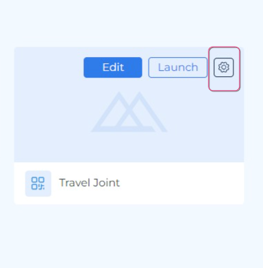
Click this Gear icon if you want to Edit App Name, Edit App Icon, Clone or Delete App.
👉 Edit App Name
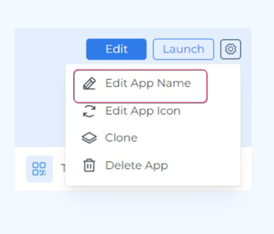
Edit App Name
👉 Edit App Icon
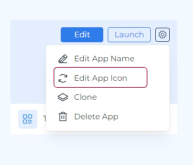
👉 Clone
You also can clone your app. In this case, Clone means the possibility of duplicating your existing app. This feature is useful when you have to make changes to the already existing source app and wish to keep the source app unchanged. In other words, Clone is an operation of making a copy of the chosen app.
To Clone your app, follow the steps below:
👉 Delete App
👉 Templates
This tab is a showcase for all Templates available on the PLATMA platform.
On the left pane, you’ll find all categories of templates, or you can also view all templates as tiles on the initial screen.
👉 How to work with the Templates tab?
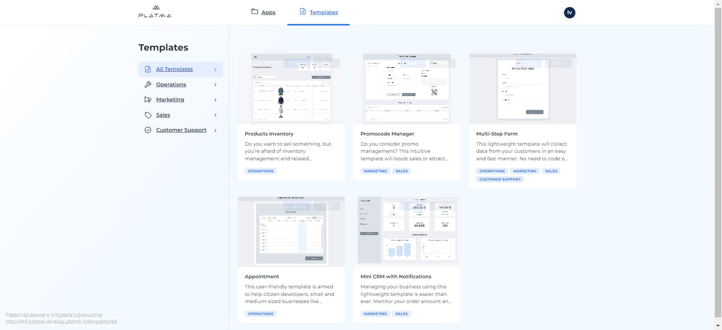
Tab Templates
After navigating to the Templates tab, you’ll see the pane on the left side. By default, you’ll start from the category All Templates. This category contains all templates currently available on the PLATMA platform.
The category All Templates allows you to overview all templates and navigate through pages using left and right arrows at the bottom of the screen.
👉 Categories
If you suppose the category of the necessary template, try to search for it in the respective category:
Note: every template might belong to several categories due to its logic. So, you can find the same template in different categories. In this case, take a look at the template name and description. Remember, on our platform, we don’t have templates with the same name and descriptions. Every name and description is unique, but every template still might belong to different categories.
Navigate categories just by clicking on the necessary category. All templates in the respective category are shown on the dashboard for overview as tiles.
👉 Template image, description, category
Every tile of every template contains the following information:
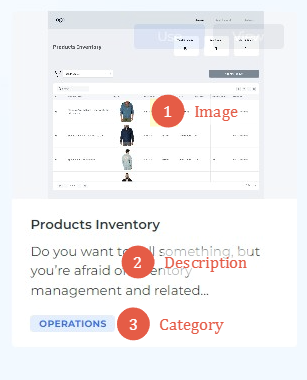
Template image — it shows how this template looks. It shows only the first page of the template.
Template short description — is located under the template image. It shows a brief description of the template.
Template category — shows the category the template belongs to. The template might belong to several categories. All the categories are listed at the bottom of the tile for every respective template.
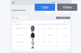
👉 Use and View a Template
On the Templates tab, hover the mouse over the necessary template. Two buttons appear in the upper right corner when you hover the mouse. These buttons are Use and View.
You can use the button View to navigate to the templates’ screen. Every template screen for every separate template contains the following information on the left pane:
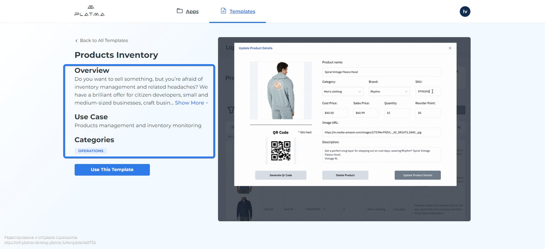
Overview, Use Case, and Category pane
👉 Overview
This is a short description of the main concept of this template. You can get ideas of working fields from this description.
👉 Use Case
A Use case means the best area to apply the current template.
👉 Category
The section Category is designed to help you with your choice and to facilitate the search.
The center of the screen is a dedicated area for a video about the current template. The video shows what exactly the template looks like with the predefined settings. In the video area, you can see all the power and magic of PLATMA’s low/no-code solutions. The main design and workflow of the current template are shown here.
You can certainly make some changes in the template later, but the concept remains unchangeable.
If you like the template, click “Use this template” below the Category.
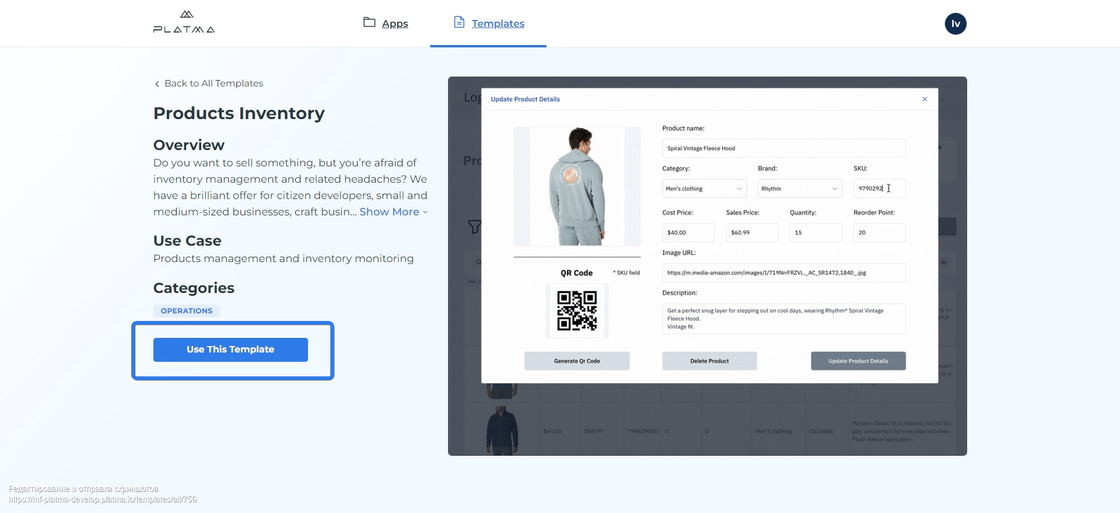
Use this template
A pop-up appears. In the pop-up, click Use this template and the current template will be added to your dashboard My Apps.
If you change your mind about the current template, click Cancel. A pop-up disappears, and you return to the current template page. Click Back to All Templates to exit the current template page.
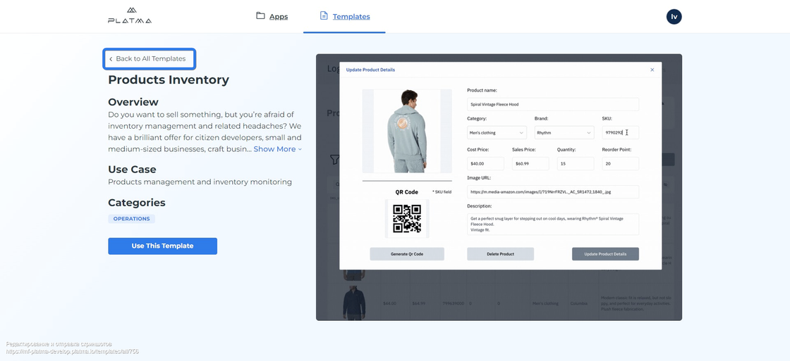
Back to All Templates
If you already know the template and you have made a final decision on the template, click the button Use.